When it comes to beauty and wellness branding, color is more than just a visual element—it’s a powerful tool that shapes perceptions, evokes emotions, and influences decision-making. As a graphic designer specializing in branding and website design for beauty and wellness providers, understanding the psychology of color is crucial in creating designs that resonate with your target audience and elevate your brand.
Why Color Matters in Beauty and Wellness Branding
Color plays a pivotal role in how your brand is perceived by potential clients. In the beauty and wellness industry, where the focus is on self-care, relaxation, and well-being, the colors you choose can significantly impact how your brand is received.
Colors evoke emotions and can influence behavior. For example, warm tones like pink and peach can evoke feelings of comfort and calm, while cool tones like blue and green can create a sense of tranquility and trust. Understanding these associations allows you to create a brand identity that not only stands out but also aligns with the emotional and psychological needs of your audience.
The Trend of Soft and Pastel Colors in Beauty and Wellness
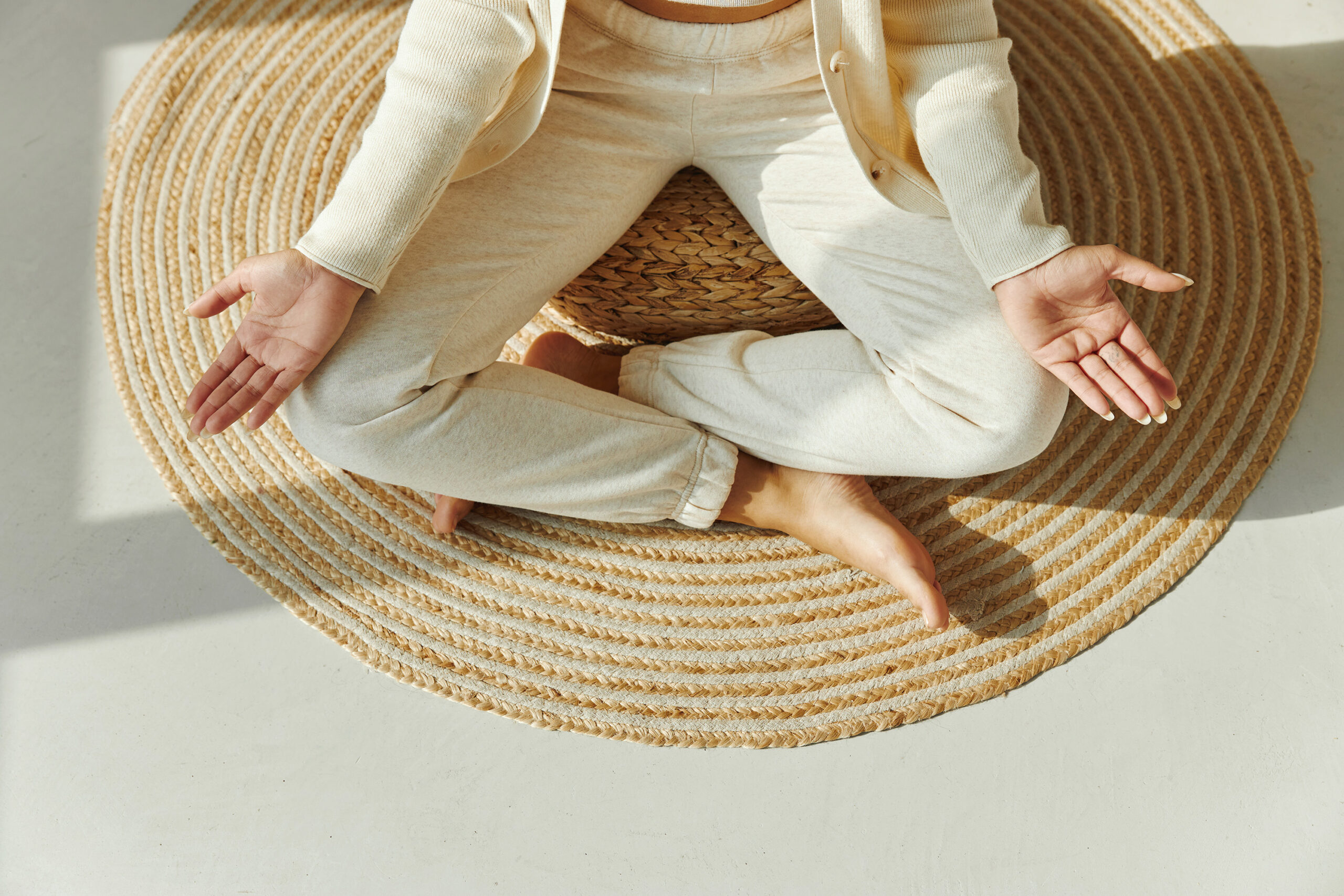
A common trend in the beauty and wellness industry is the use of “soft” or pastel versions of traditional color palettes. These gentle hues are particularly effective in creating a calming, approachable, and soothing brand image—qualities that are highly valued in this space.
While soft and pastel colors are popular for their ability to evoke feelings of relaxation and well-being, it’s important to choose a color palette that authentically reflects your brand’s personality and the emotions you want to evoke in your audience. Trends can guide your choices, but your unique brand identity should always take precedence.
Unlock the Potential of Your Brand Colors
To help you make the most informed decisions about your brand’s color palette, I’m offering a Free Wellness Brand Audit. This comprehensive audit includes a dedicated section on color psychology, providing insights and actionable recommendations tailored to your specific brand needs. Discover how the right colors can enhance your brand’s appeal and connect more deeply with your audience.
Download Your Free Wellness Brand Audit Now
The Psychological Impact of Key Colors
Understanding the psychological impact of different colors can help you select the hues that best represent your brand and resonate with your audience.
Pink: Nurturing and Feminine
Pink is often associated with femininity, warmth, and care—qualities that are highly valued in the beauty and wellness industry. It can create a nurturing environment, making it a popular choice for brands targeting women, such as estheticians and spas. Lighter shades of pink convey softness and compassion, while deeper shades like rose or mauve can add a touch of luxury and sophistication.
Green: Natural and Healing
Green is synonymous with nature, growth, and health. It’s a versatile color that can evoke feelings of balance, freshness, and renewal, making it ideal for wellness brands such as yoga studios, acupuncturists, and holistic health providers. Green’s calming effect can help clients feel more relaxed and at ease, reinforcing the idea that your brand is a sanctuary for self-care.
Blue: Trustworthy and Calm
Blue is often associated with trust, reliability, and serenity. It’s a popular choice for brands that want to convey professionalism and tranquility, such as massage therapists and skincare specialists. Lighter blues are soothing and can create a sense of peace, while darker blues can instill confidence and authority.
Purple: Luxurious and Spiritual
Purple combines the calm stability of blue and the fierce energy of red, making it a color of luxury, mystery, and spirituality. It’s a powerful choice for brands that want to create a sense of exclusivity or tap into the more spiritual aspects of wellness, such as meditation centers or high-end beauty products. Purple can make your brand feel both luxurious and profound.
White: Pure and Clean
White is the color of purity, cleanliness, and simplicity. It’s a popular choice for beauty and wellness brands that want to emphasize cleanliness and efficiency, such as skincare lines or minimalist yoga studios. White also provides a blank canvas that allows other colors to stand out, making it a versatile addition to your brand’s color palette.
How to Choose the Right Colors for Your Brand
Choosing the right colors for your beauty and wellness brand starts with understanding your target audience and the emotions you want to evoke. Consider how each color will resonate with your target demographic and align with your brand’s values.
Once you’ve selected your brand colors, implementing them consistently across all your branding materials, including your website, social media, and marketing collateral, is crucial. For example, use your primary brand color in your logo and headlines, and complement it with secondary colors in buttons, icons, and backgrounds. Consistent use of color helps reinforce your brand identity and makes your website more visually appealing and cohesive.
Conclusion
The psychology of color is a crucial aspect of beauty and wellness branding. Whether you embrace the trending soft and pastel tones or opt for more vibrant hues, your color palette should align with your brand’s values and resonate with your target audience. By strategically choosing colors that connect emotionally with your clients, you can create a brand identity that not only stands out but also enhances the overall experience you offer.
If you’re looking to elevate your beauty or wellness brand through thoughtful and impactful design, I’m here to help. As a graphic designer specializing in branding and website design for the beauty and wellness industry, I understand how to harness the power of color to create a brand that truly shines. Contact me today to discuss how we can create a visual identity that resonates with your audience and enhances your brand’s presence.
